BILL
The Trinity Design System
Triangulating three product platforms across legacy tech stacks and zero shared infrastructure into a cohesive platform design system.
Triangulating three product platforms across legacy tech stacks and zero shared infrastructure into a cohesive platform design system.
Overview
Following BILL's acquisitions of Divvy and Invoice2Go, the company found itself operating three distinct products each with its own design system, experience requirements, and engineering culture.
BILL lacked a single source of truth and had been built on legacy tech across 10+ repos using fragmented libraries including React, Angular, Web Components, and ng Material. Every team had built their own versions of the same experiences, creating a patchwork of inconsistent experiences that confused users navigating between products.
I was assigned as design lead to audit the entire component landscape, architect a unified foundations structure, and execute a migration strategy that could bring three splintered products into a single, cohesive platform without breaking anything in the process.
The problem
No single design system across 3 converging product platforms.
My role
Design lead
Collaborators
Lead ICs, Managers, and Directors across Design, Product, and Eng throughout the BILL, Divvy, and Invoice2Go ecosystems.
Audit & Discovery
I conducted a comprehensive cross-platform component audit — inventorying every component across design files, React, Angular, Web Components, and ng Material for each product. Then worked cross-functionally with PM and Engineering to map workflow contexts and identify requirements.
Design file audit
Catalogued every component, variant, and token across Figma libraries for BILL, Divvy, and Invoice2Go
Codebase inventory
Audited implementations across React, Angular, Web Components, and ng Material — tracking naming, props, and behavioral differences
Cross-functional requirements
Worked with PM and Engineering to map workflow contexts, identify integration points, and surface migration constraints
| Component | BILL | Divvy | Inv2Go |
|---|---|---|---|
| Button | |||
| Text Input | |||
| Modal | |||
| Data Table | |||
| Navigation | |||
| Select | |||
| Toggle |
Key Decisions
A three-tier system — base, semantic, component — that satisfied all three products and scaled to white-label partner themes from a single configuration file.
Trinity 3-tier token contract
/* Tier 1 — Semantic (theme-scoped) */
semantic --tri-interactive-fg-action-normal: #473CC5
semantic --tri-color-text-primary: #1C1B1B
/* Tier 2 — Component */
component --tri-btn-fill-primary-normal: var(--tri-interactive-fg-action-normal)
component --tri-btn-text-primary-normal: #FFFFFF
/* Tier 3 — Theme override (Aire) */
[data-theme="aire"] --tri-interactive-fg-action-normal: #177575
With heavy XFN collaboration, I scored each component on behavioral overlap, migration cost, and user impact to identify where three implementations could merge without regressing any product's UX. This enabled me to update and rebuild the component library itself.
Convergence scoring
The Design System engineers built and released the components in coordinated waves so all three products could adopt each batch simultaneously — preventing drift and maintaining a consistent baseline.
Release batches
Foundation
Tokens, typography, color, spacing
Primitives
Button, input, toggle, checkbox, radio
Composites
Cards, alerts, tabs, select, modals
Patterns
Data tables, navigation, forms, layouts
System & Scale
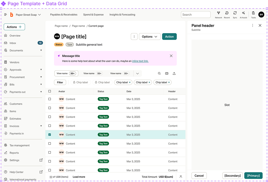
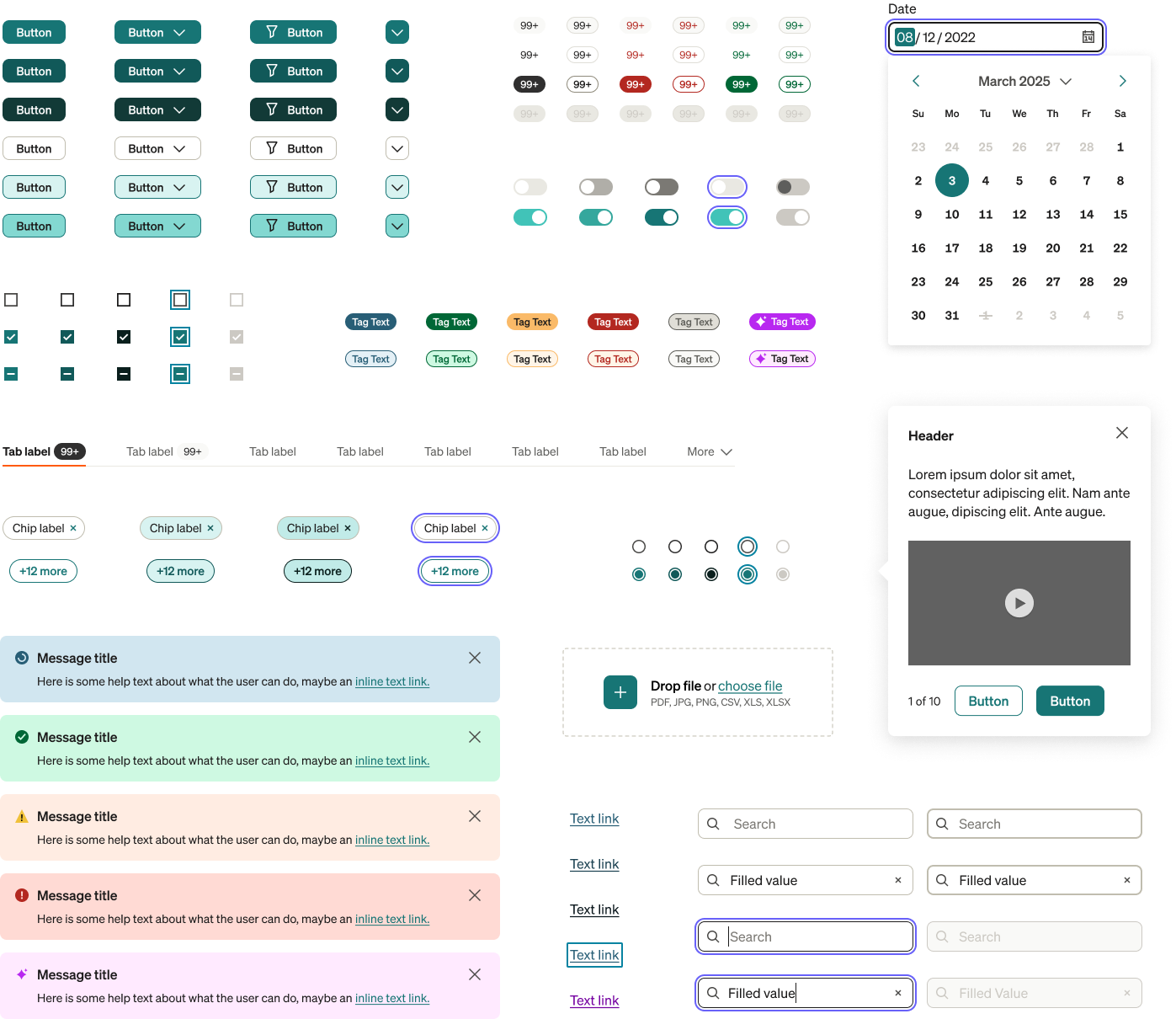
Check out the component playground and theme switcher below to see how the design system can be used to create a consistent experience across all three products.
Buttons
Type
Size
With Icon
Text Input
Controls
Tags
High emphasis
Low emphasis
Selection
Banners
Content Switchers
Card
Card
Acme Corp
Invoice #INV-4291
Card
Impact & Outcomes
The updated Trinity Design System delivered meaningful infrastructure- a token architecture that scaled across products and partner themes, a component taxonomy that mapped three disparate implementations into a shared language, and a batch migration strategy that gave teams a clear adoption path.
However, the system's impact was ultimately constrained by org adoption. The token system worked, the components were solid, and the migration path was clear but the compounding reality of migrating three products simultaneously, across legacy codebases that weren't designed for system-level changes, without company prioritization created adoption friction that exceeded the org's capacity or willingness to adapt at that time.
This friction surfaced a deeper truth: the real problem wasn't just design fragmentation, it was architectural. Which ultimately led to the company-wide modernization initiative.