BILL
The Trinity Template Library
Systemizing page-level architecture, interaction patterns, and layouts across BILL's platform — the infrastructure layer between components and full product experiences.
Systemizing page-level architecture, interaction patterns, and layouts across BILL's platform — the infrastructure layer between components and full product experiences.
Overview
The Trinity Design System gave BILL a unified component library — buttons, inputs, tokens, and primitives that worked across three products. But a shared component library doesn't tell designers how to structure a settings page, lay out a data-heavy workflow, or guide a user through a multi-step process. Teams were still assembling pages inconsistently, interpreting the same components into wildly different information architectures.
The Trinity Template Library was the next layer: reusable, page-level templates that prescribed information architecture, interaction patterns, navigation structures, and responsive behavior. Serial processes, data grids, drawers, panels, modals, page headers, tabs, filters, breakpoints, margins, and the UI shell itself — all codified into adoptable templates with configurable sub-components and properties.
I partnered with our Platform Principal Designer to define the template taxonomy and architecture, then worked with 6 staff+ engineers to build code counterparts for each template — enabling teams to adopt complete page structures rather than assembling them from scratch.
The problem
No unified toolkit to align global UX patterns at BILL.
My Role
Design Lead
Collaborators
Principal Designer
The Challenge
Unified components solved the consistency problem at the element level. But the experience layer — how pages are structured, how workflows flow, how information is organized — remained a free-for-all.
Research & Discovery
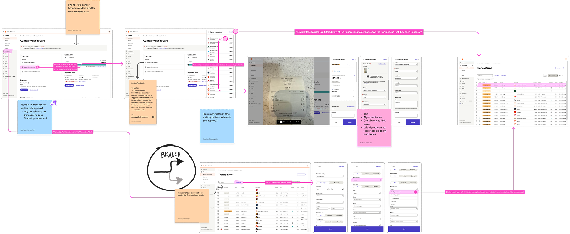
Rather than designing templates in isolation, I partnered with the Head of Design Ops, 2 Senior Design Directors, 2 Principals, and a Staff Designer to run a series of org-wide workshops that inventoried every core flow across the ecosystem — grounding the template library in real organizational knowledge.
Mapped every core workflow across BILL, Divvy, and Invoice2Go — payments, approvals, onboarding, reporting, settings — to create a comprehensive ecosystem view.
Evaluated each workflow against consistency, usability, and architectural criteria — surfacing where the experience broke down and where patterns repeated.
The design org walked through the full cross-product experience end-to-end, documenting friction, inconsistencies, and navigation breakdowns in real time.
Aggregated experience and architecture requirements across all workshops, distilling them into template specifications: functionality, sub-components, and properties.
Leveraged the full design org to capture 300+ unique product flows and thousands of screens.
Key Decisions
Three structural decisions shaped the template library's ability to scale across products while remaining flexible enough for each team's needs.
Defined what qualifies as a "template" vs. a "pattern" vs. a "layout" — then identified the canonical set that covers the vast majority of product workflows.
Canonical templates
Each template composed of configurable sub-components with a property model that let teams customize behavior without breaking the architecture.
Sub-components
A unified UI shell defining navigation, margins, breakpoints, and panel behavior that all templates inherit — the structural skeleton of every page.
Breakpoint system
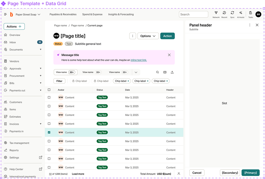
Template Library
Each template defines page-level structure, navigation patterns, and interaction behavior. Browse the library below — these are interactive wireframes demonstrating core template functionality.
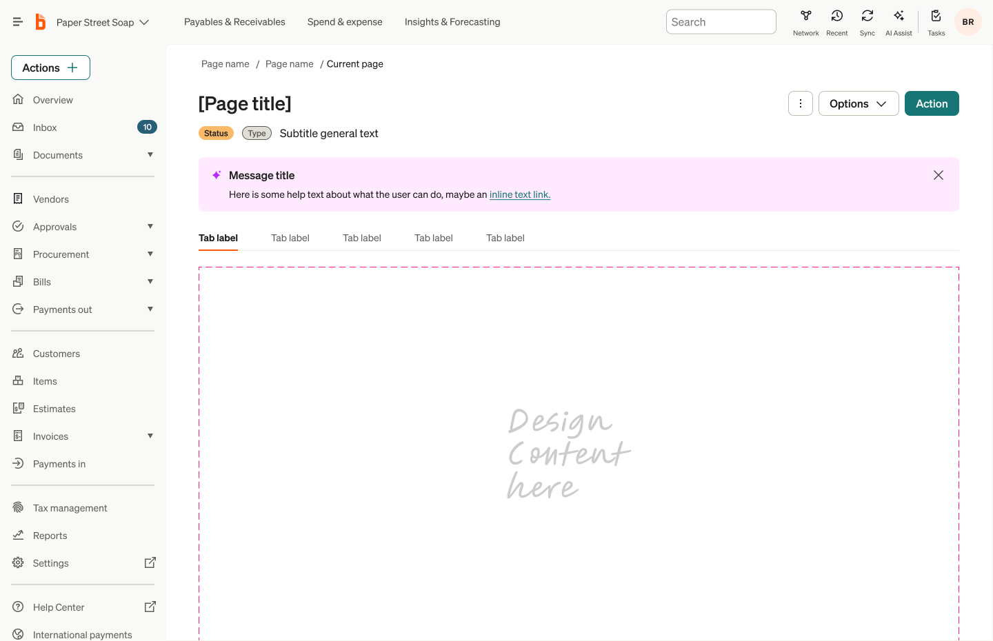
The foundational layout for all primary product views. Defines the relationship between the UI shell, page header, and canvas content area.
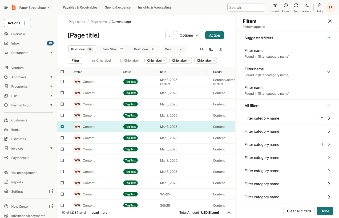
Data grid is the cornerstone of the BILL product experience. Structures dense tabular data with inline actions, sorting, filtering, and pagination.
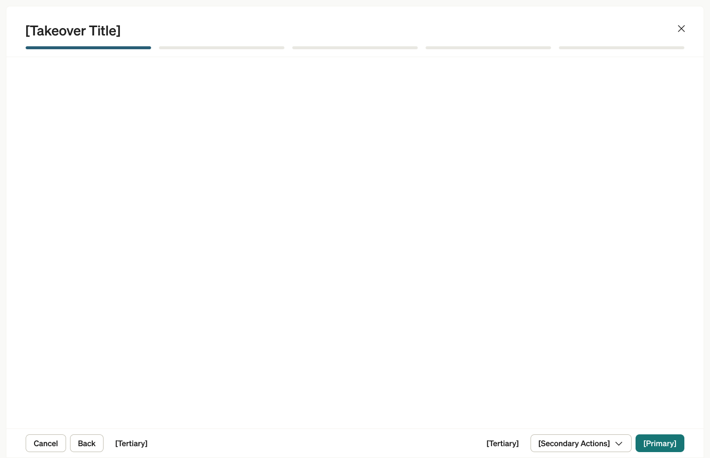
A popover container to serve single or multistep workflows that guide users through tasks like creating payments, onboarding, or completing approvals.
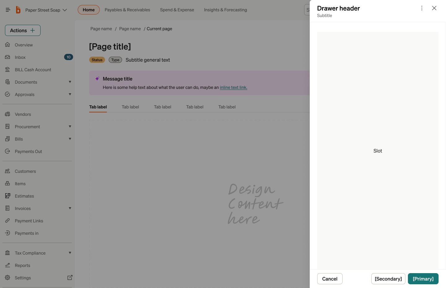
Contextual overlays that slide in from the right to show detail views, edit forms, or secondary workflows without losing page context.
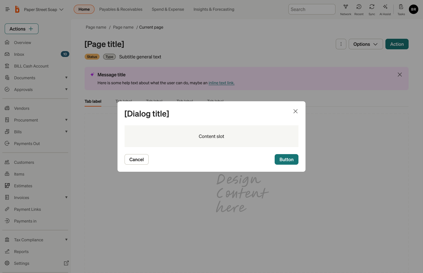
Focused interruption for confirmations, destructive actions, or compact task completion that demands user attention.
Impact & Outcomes
The template library fundamentally changed how designers approached new features. Instead of making page-level architecture decisions from scratch, teams selected the appropriate template, configured sub-components, and focused their energy on the unique aspects of their feature.
Cycle Time
Design execution on new features accelerated dramatically — page-level decisions that took days were reduced to template selection and configuration.
Consistency
Cross-product consistency improved at the experience level — not just at the component level. Pages across BILL, Divvy, and Invoice2Go began to feel structurally coherent.
Confidence
Designers — especially those newer to the platform — could execute with higher confidence, knowing their page architecture was grounded in validated patterns.
The most significant outcome wasn't measurable in a dashboard. It was the shift in how the organization thought about design infrastructure. The template library proved that the layer between components and products — the experience architecture layer — was where the highest-leverage design decisions lived. This insight became the foundation for the Modernization initiative that followed.